Project Description
Whim builds “canvas” - thin, light-weight screens of various sizes that can be mounted on the wall easily. WHIM provides IoT service that allows user to stream content on their phones to canvases with the WHIM app.
The WHIM app is made of a group of “mini apps” - each performs a specific function. The YouTube mini app uses the YouTube API to load user data to the WHIM app, thus users can watch YouTube content on canvas.
I started this project from scratch. I developed the branding system, mapped the user flow and crafted the UI.

Challenge
1. Experience Transfer
Most of YouTube users are already familiar with navigating the YouTube app, which means that reinventing the wheel here is pointless, even harmful because it adds learning curve for users to transfer their experience. Ideally, users who are familiar with the YouTube app should be able to transfer their experience to this mini app seamlessly.
2. Affordance for “Showable” Content
In the YouTube mini app, the user should be able to stream videos on the canvas, view the comments and reply to them on the canvas. How do we indicate that the content is “showable” on canvas using visual affordance?
Solution
1. Create Familarity
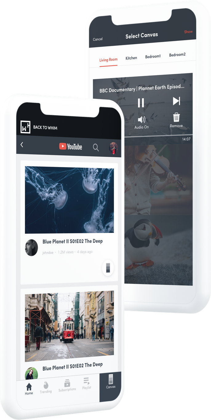
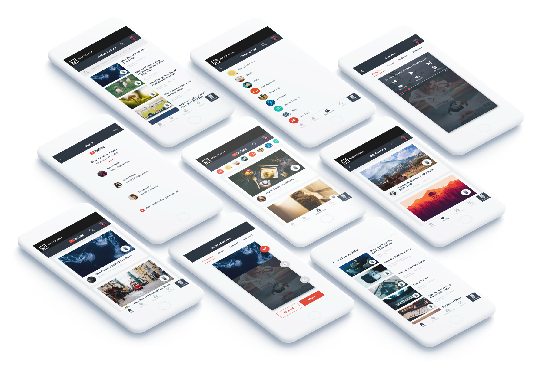
In crafting the UI details, I mixed the UI design of the YouTube app with WHIM’s visual elements for users to transfer their experience smoothly. The icons in the mini apps remsemble the YouTube ones, and the basic user flow remains the same. If the user knows which icon does what in the YouTube app, she should be able to do the same thing in the mini app.
2. Project the Canvas to UI
Projecting the real environment to the digital interface helps users make near transfer of experience.
I projected the appearance of the actual canvas to the design of the “canvas icon”, which will trigger the canvas screen where user can manipulate what to show on the canvas. The canvas icon here works as an affordance for user to connect it with the actual canvas.
Design Outcome
The new design was successfully applied to the existing product and the product looks much better.
Currently Swiftdine is working with local partners in LA, and is expanding its business in both east coast and west coast.
