Project Description
To engage users with WHIM canvas, WHIM wants to build WHIMToday, another mini app so that user doesn’t need to use other channels such as Apple notification center or Android Google Now to have their daily essential information.
WHIM Today is an information hub where users can view time, weather, news feed, events and more from their mini app.
Challenge
1. Experience Transfer
The canvas is a 1980 x 1080 area, but it carries information including: weather, reminder, todo, clock, news headlines, traffic, inspirational quotes, stock, notes and photo albums. We want to make sure that the information display is rich, but tidy and easy to read at the same time. How can we fit all the information into this limited space without messing up the UI?

Solution
Card Design: A Metaphor
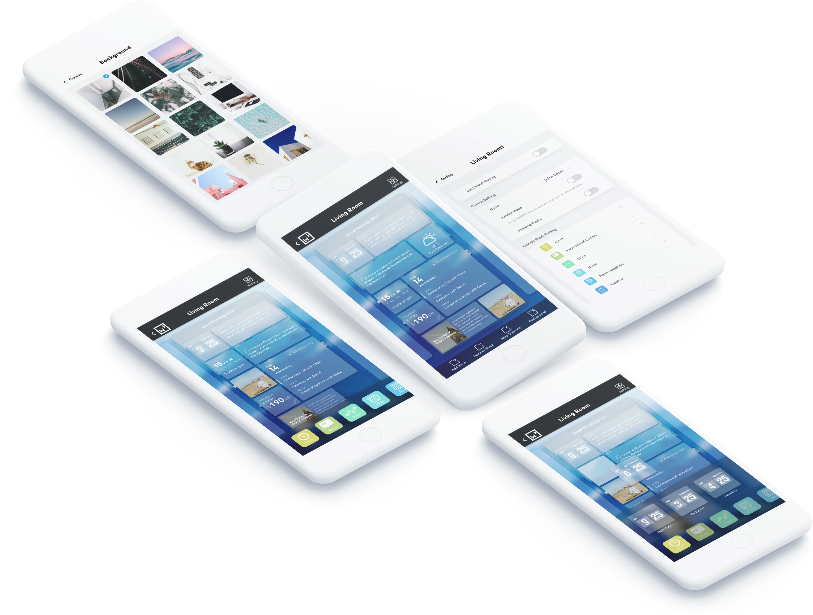
Card is a perfect vessel to carry a small piece of information. The flexible nature of cards indicates that they are movable, dropable, stackable and removable. Users can simply drag and drop the card “onto” the canvas or drag and drop it out of the canvas to remove it
The stackable nature of cards adds one more dimension in the z axis to the information carrier.

Design Outcome
In the final design, each information is carried in a card. Background can be seen through the frost glass effect of the card, and user can customize the background.
We used “block” here to refer to the cards in the mini app. User is able to add a block to the canvas, remove a block from the canvas, or stop WHIMToday from showing on the canvas.
If the user taps “add block”, a toast menu listing blocks that are not showing on the canvas at the moment will pop up. The user can drag and drop the block’s icon into the canvas to show the content of this block.
If the user taps “remove block”, a toast menu containing an empty slot will pop up. The user can drag and drop the block from canvas to the slot to remove it from the canvas.
