Project Description
Speech recognition is one of the major milestones for designers and developers to unlock the next generation user experience with various devices. However,most speech recognition APIs today are designed to be one size fits all. Most on-shelf speech recognition APIs are hard to customize, expensive and hard to use.
AssemblyAI wants to change this by building fully customizable, easy to use speech recognition API that everyone can afford.
I worked as the lead product designer and built the design from scratch. I led the design projects across the entire product lifecycle from prototyping, illustrating, UI/UX design to front-end development.
Design Requirements
1. Branding
Being a tech company does not mean that the branding has to be serious. AssemblyAI wants to be playful, fun and overall, the branding should deliver a cool vibe.
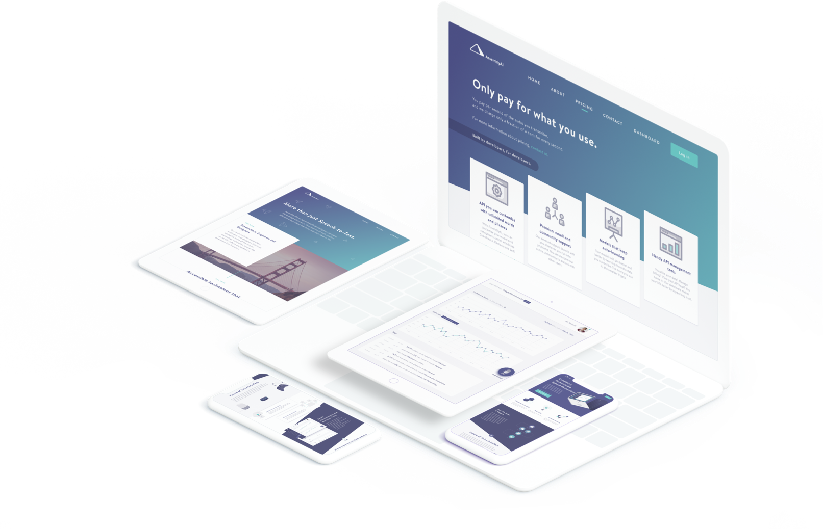
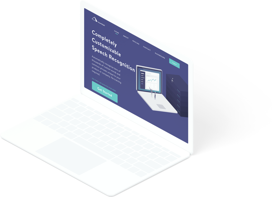
2. Website
The website needs to:
a. Explain what the company does;
b. Provide company and pricing information;
c. Funnel users and bring conversion;
d. Provide various ways for people to reach out to the team.
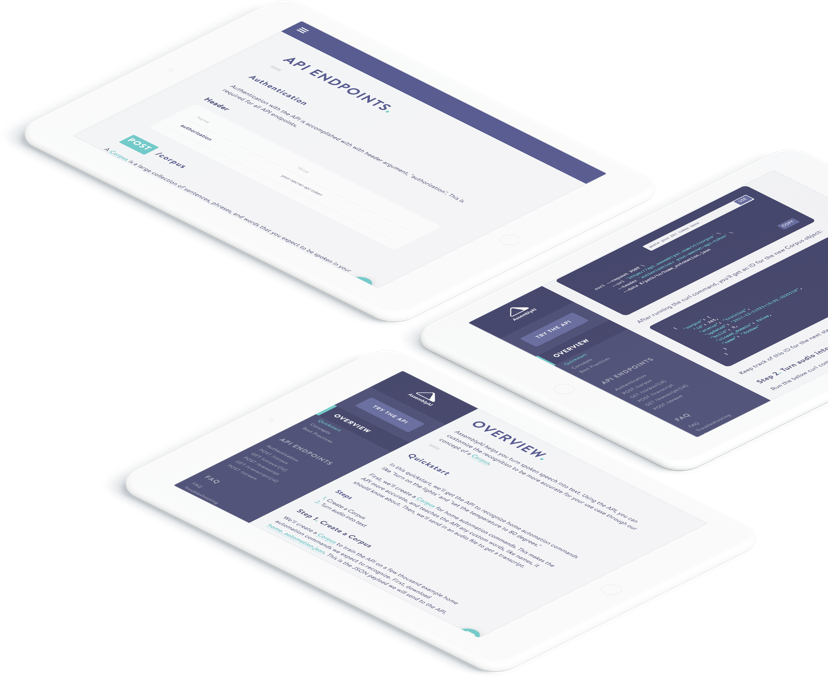
3. Documentation
Badly written and poorly designed documentations are nightmare to developers. Unfortunately, documentations are rarely done right. For tech companies like AssemblyAI, a well-structured, carefully designed and nicely written documentation is one of the key factors in crafting delightful user experience.
4. Dashboard
Dashboard is where most of the use cases happen. The dashboard should provide:
a. Nice on-boarding flow;
b. Instant access to the support;
c. Quick links to the documentation;
d. Visualized user data
e. Trouble-shooting flow
f. Account Setting
g. Ways for users to download data and logs
Challenge
1. Developing Branding System from Scratch for Unknown Users
AssemblyAI did not have one single real user when we first started the design. We aimed at developers, most of whom are young, curous and geeky, but lacking real data about our potential users, our identification of the users were based on sheer observation and intuition.
2. Reduce Cognitive Load... Don't Smash Technologies at You User's face
As a designer/developer hybrid, I flich at the idea of trying new APIs, because it usually means a head-scratching afternoon reading obscure docs and crying for help on Stackoverflow. We want to make it minutes, not hours for users to implement our API into their product. Thus, recuding cognitive load in our docs and dashboard is important in crafting user experience with our API.
Solution
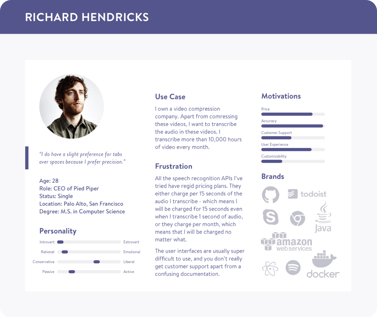
1. Learn about Our Users
Our potential users fall into 3 buckets:
- Individual developers who is building cool personal side projects like smart home automation systems
- Early startups that use speech recognition API to support their business
- Large companies who are looking for a alternative solution for their current speech recognition service, either because the current solution is expensive or hard to customize.
We sent out surveys, asking people the following questions:
- What project are you working on?
- Is it personal project?
- What speech recognition API are you using right now?
- How many speech recognition API have you tried (Google Speech API, IBM Watson STT, wit.ai, Twilio...), and how do you like them?
- Can you tell us a typical use case of your project?
- What are the most important factors to you when choosing speech recognition APIs?
- How many audio are you looking to transcribe on daily basis?
Based on the feedback we collected, I made a persona.
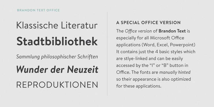
02. Font Selection: Nerdy & Sleek
Before I head right into the design, I spent a week studying fonts. Brandon sans serif family seems to be a nice fit because of its modern look. I especially like the rounded corner because compared with Futura, the font known for its modern and sleek look, the rounded corner makes Brandon family looks less “aggressive” but nerdier.
Brandon Grotesque Sans Serif is hot in recent years, but personally I think it works better with headers instead of long text flow because of its compact counters. The Brandon Text family looks more "relaxed". It is optimized for long texts. Its less dramatic ascender and bigger counter give it more readability and thus it works better with small text sizes on multiple screens.
03. Help! 
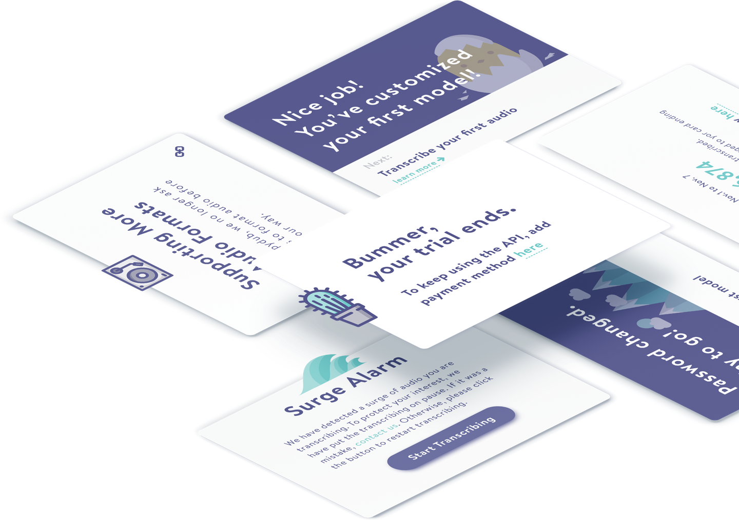
Getting around a new product can be tough for new users, and the drop-out rate is at its maximum in the first few tries. I designed an on-boarding flow based on cards in the dashboard for new users. Users are encouraged to proceed with every small step they make. Apart from the on-boarding flow, a “survival kit” carrying quick links to the support is always available in the dashboard.
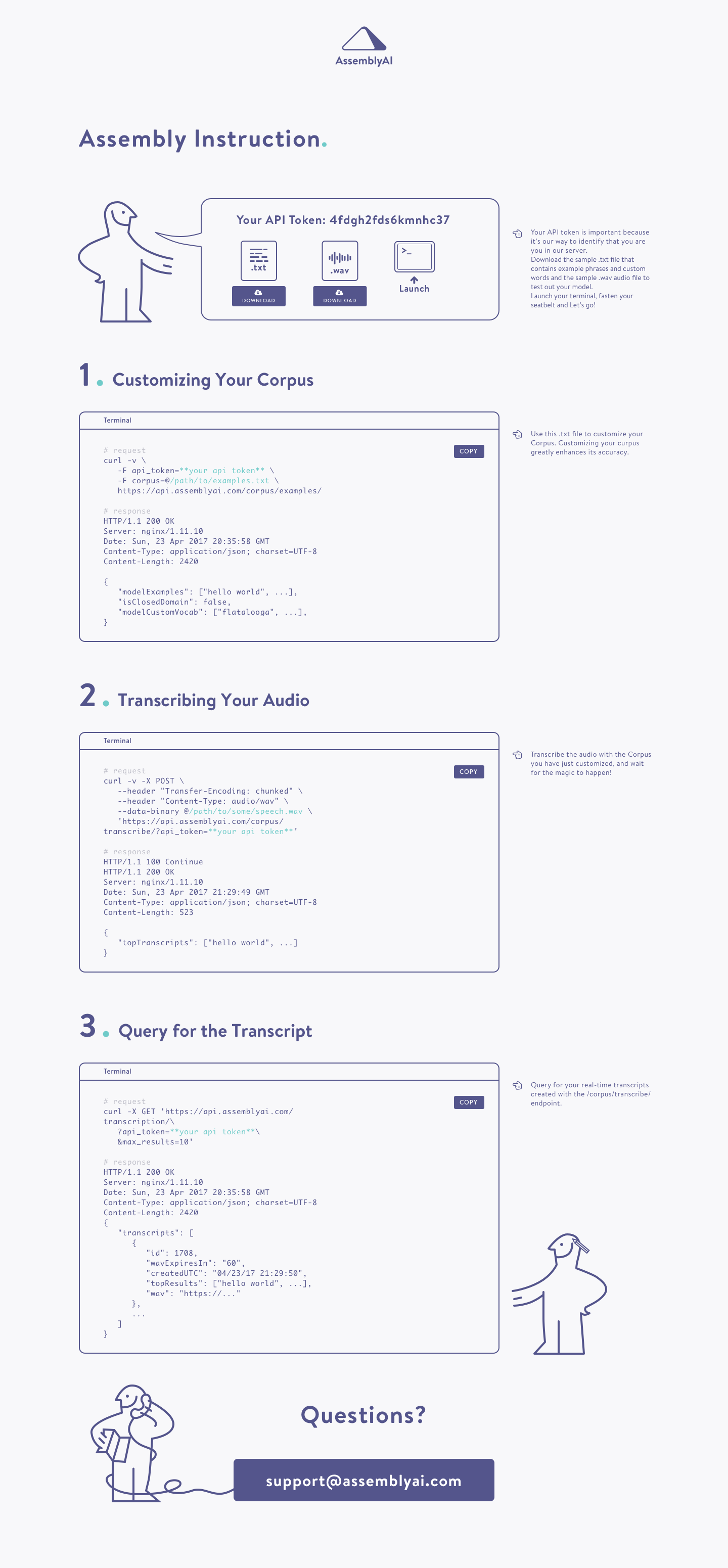
Assembly Instruction is yet another design aims to help users getting started more quickly with the API. We resemble IKEA’s assembly instruction ( yes, you get the pun ) to build this guide to walk users through the basic usage of the API. We provide users with sample audio and example phrases as a worked example. Users can simply copy the code block into their terminals to see how it works.
04. Bottleneck? Opportunity!
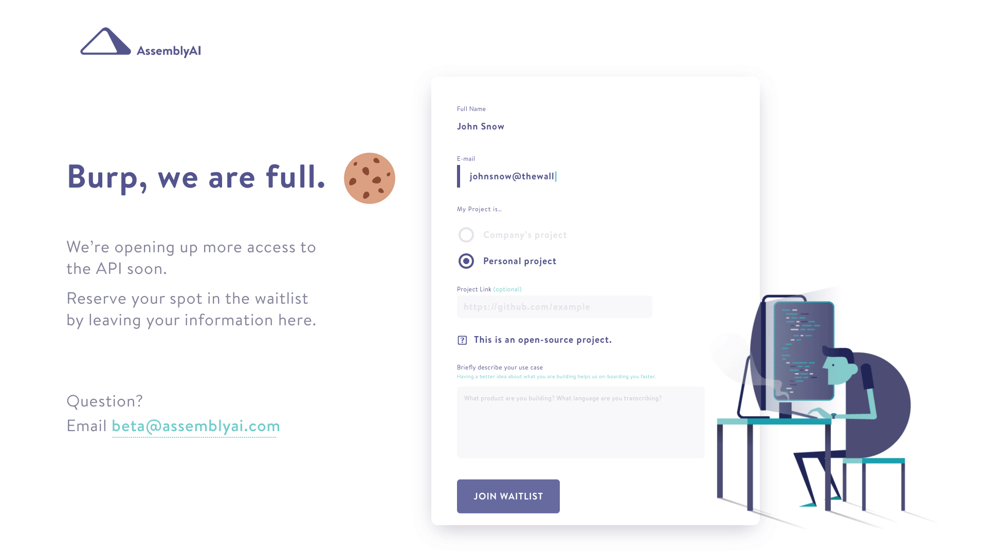
How do you keep people interested even after closing public registration? Soon after launching, we reached our maximum capacity to support users for the beta product. However, as a small business we value every single potential user who clicks “Try the API”, so we do not want to frustrate them by simply saying “oops we have to put you in the waitlist”.
Subtle animation, as a piece of eye candy brings enjoyment. In order to counteract the frustration of being put in the waitlist, I came up with a cute animation of a developer coding, tapping his foot, waiting for the access.
I came up with funny ways to tell people that we are suspending regisration for now (“Burp, we are full”). A form funnels potential users by collecting information from them.
This design achieved huge success: we kept hearing from people about how they love the animation, and the conversion rate of this page reached 56% in two weeks. Careful design like this puts us in a better position when we are ready to on board new users.
Result
Afully- studied, sophisticated design system and a thorough brand identity have been built.
We keep hearing from people about how they like the design and the product.
3 months after the website’s launch, AssemblyAI got funded by YCombinator (S17). The product was introduced to the public by TechCrunch and Product Hunt.
We are lucky that we had the best users in the world. As an early startup, we work super closely with out users, which gave me - as a designer - precious opportunity to learn from users feedback and make fast iterations.