Project Description
I'm a big fan of MUJI product because of its minimalist design and modern look.
Studying MUJI’s history, one will find design rooted in MUJI’s blood. MUJI was founded by a bunch of famous Japanese designers including Ikko Tanaka, Takashi Sugimoto and Kazuko Koike.
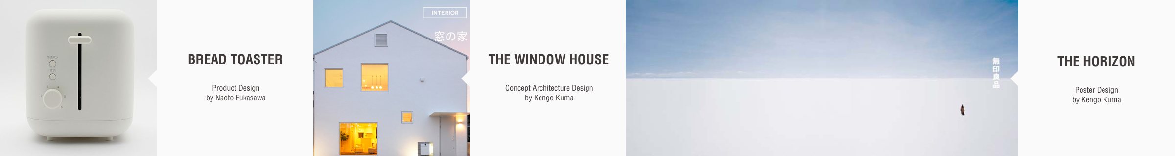
After Tanaka, Kenya Hara took over the role of MUJI’s art director. Collaborating with Naoto Fukasawa, an award-winning industrial designer and Kengo Kuma, a famous architect, MUJI has established its incontrovertible role in the area of graphic design, indestrial design and interior design.
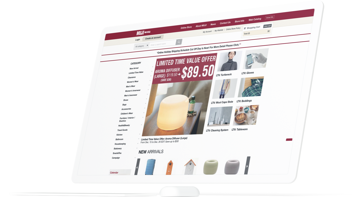
Being fond of MUJI’s design, I was astonished that MUJI’s online experience is far less delightful than its off-line experience:
The absense of information hierarchy makes the site hard to read; The abuse of carousels adds cognitive loads; Low resolution images make the site looks fake; Redundant extreneous information is seen everywhere; “fake responsiveness design” messes up layouts on mobile screen, and the site is slow.
This is when I decided to work on this website redesign concept.
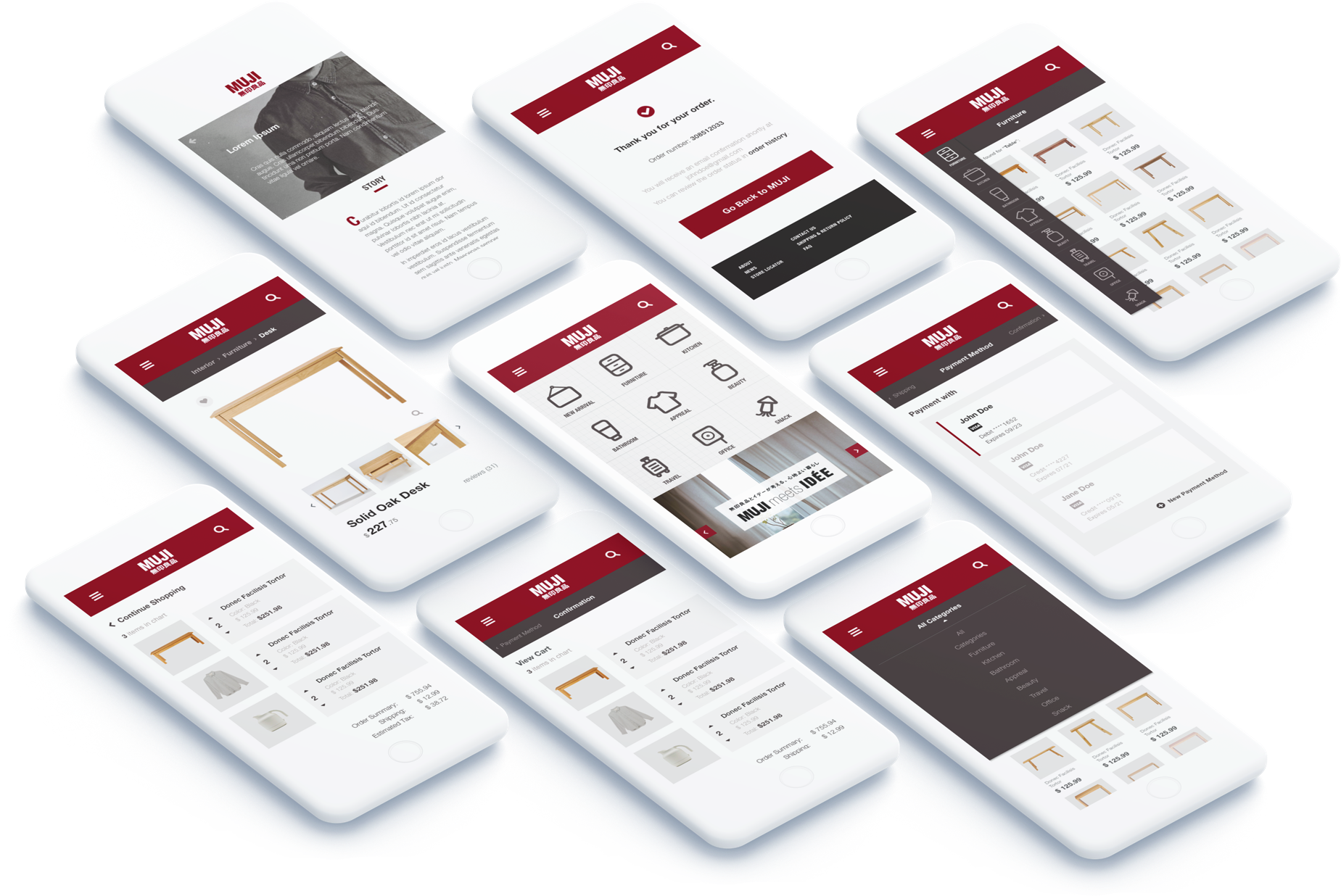
Assumption

Emily and her roommate went shopping on a weekend, and they entered the MUJI store on 5th Avenue. Emily always wanted to get a bean bag for her room, so she asked a staff if they have a bean bag in pink in store. The staff replied that they had the bean bag, but the pink case was out of stock. He suggest Emily to purchase the pink case on muji’s online store. So Emily logged into to MUJI’s online store on her smart phone.
In this scenario, Emily probably:
- - is loading the site using her cellular data
- - is carrying some shopping bags so she had to use her phone single-handed
- - has limited time because her roommate is waiting for her
In this use case, the design should:
- - place important tappable elements within the "Thumb Zone"
- - Reduce image size and do not use videos
- - Animation and images should be limited and lazyloaded
- - Limit options and information, avoid redirecting, and make sure the tappable area is big enough to eliminate fat finger mistakes
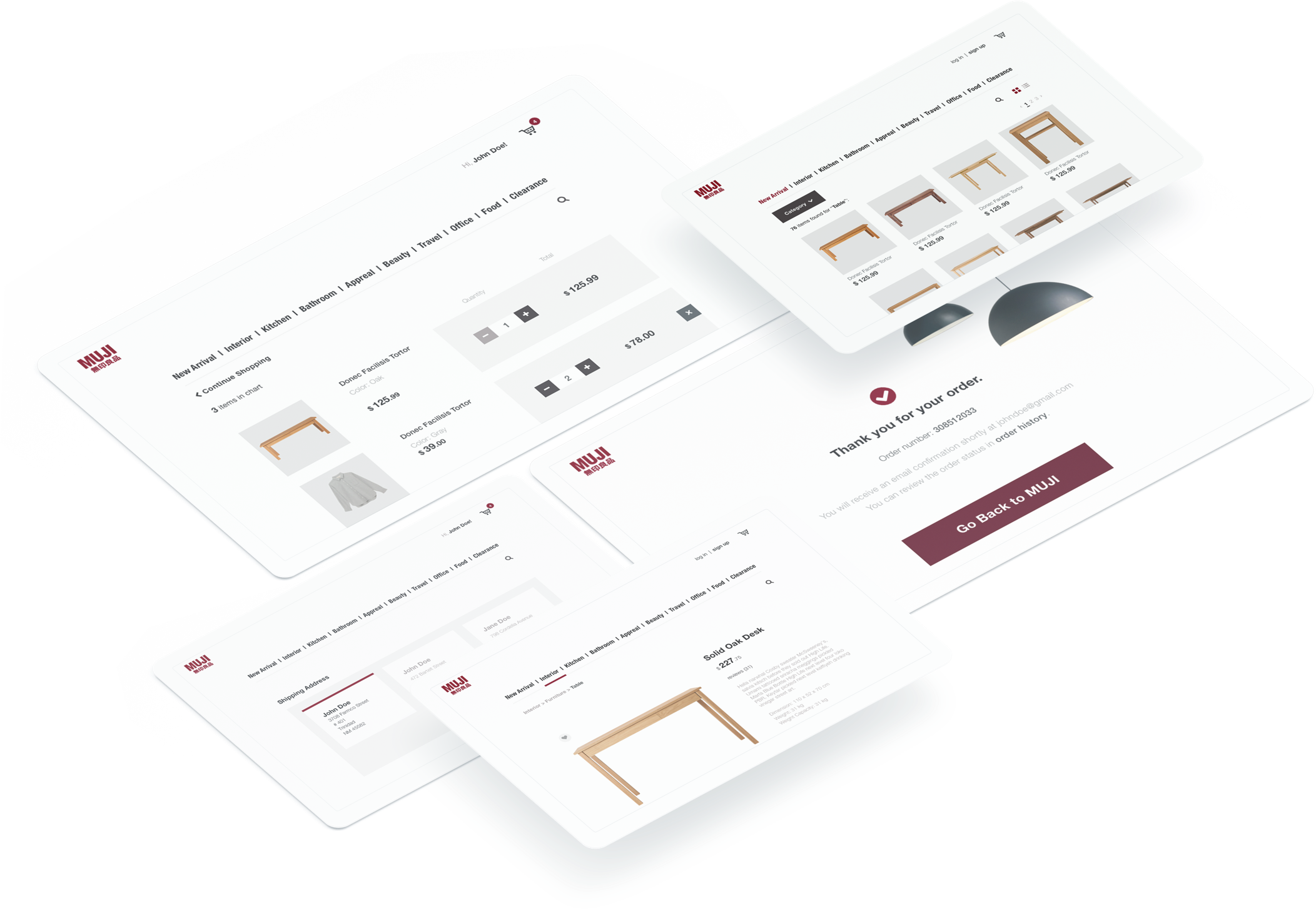
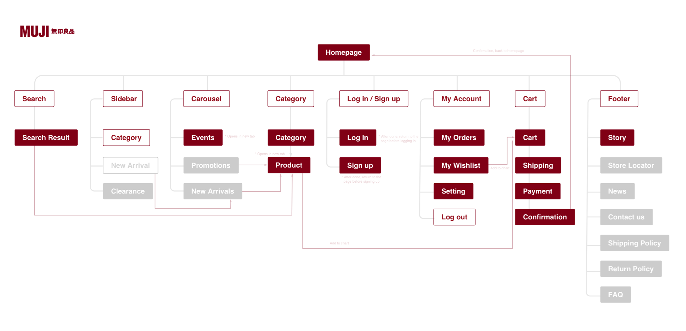
Design Requirements
Create reasonable information hierarchy
Remove extraneous content
Redesign visual elements to match MUJI’s brand identity
Enhance userbility by eliminating fat finger mistakes on mobile screen
Create real fully-responsive mobile experience
Design Process
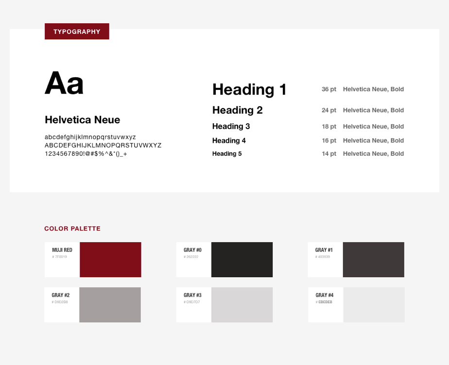
I developed a monotone color palette of MUJI red. The grayscale is toned with a subtle red hint, to make the tone feels warm.
 In the digital world, the analogy of paper is white space.
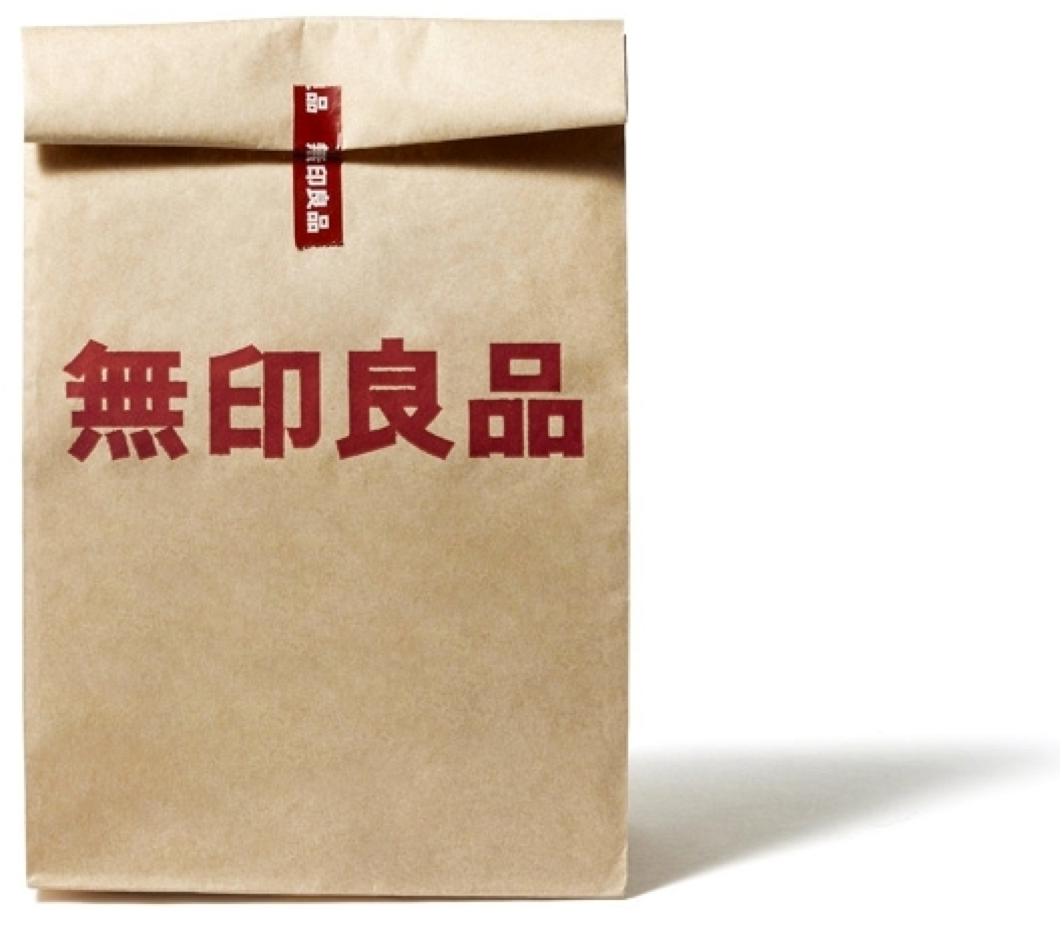
I tried to extend this concept by using paper texture in the design to imitate muji’s package. But I quickly found that after adding the texture, the design looks muddy - nothing like MUJI’s clean product design. Then I realized that in the digital world, the analogy of paper is white space. So in this design I paid great attention to the white space and learned how it creates tranquility and rhythm in design.
Design Outcome